
START
CONTACT
Reference Management Tool
Redesigning a B2B platform for seamless project archiving and internal knowledge management
Implement a first UI for a MVP and implement new features ensuring user experience
Role:
Product Designer, UX/UI Designer
Team:
1 Project Manager, 1 Product Owner, 3 Developers
Duration:
9 months
How do you design a B2B platform that makes complex information management feel effortless?
Context
PRODUCT
A B2B platform designed for company managers to upload, store, and manage project information systematically. The platform enables teams to archive all company projects in one place and export that information as downloadable templates for internal and external presentations.
USERS
Company managers who need to organize, retrieve, and share project data efficiently. Users range from those comfortable with complex workflows to those who prefer simplified, guided interactions.
BUSINESS GOAL
Revamp the platform's visual design to align with the company's brand identity, improve usability for day-to-day project management, and create a scalable design system that supports future product growth.
CONSTRAINTS
•
Complex information hierarchies needed to be simplified into intuitive, manageable flows
•
Design had to remain consistent with an existing company style guide while introducing new visual clarity
•
Responsive prototypes required to ensure a seamless experience across devices and screen sizes
•
Tight collaboration needed across stakeholders, designers, and developers to ensure accurate implementation
UX • UI • Product
May 2021 – Mar 2024
Cross-functional
The Challenge

Visual inconsistency: The existing platform lacked a cohesive visual language, making it feel fragmented and difficult to navigate for managers handling multiple projects.
Complex information architecture: Project data involved multiple layers of content that needed to be presented clearly without overwhelming the user.
Brand alignment: The redesign had to respect and extend the company's existing style guide while modernising the interface.
Handover accuracy: Ensuring design intent translated faithfully into development required thorough documentation and close collaboration.
The Messy Middle
The Solution
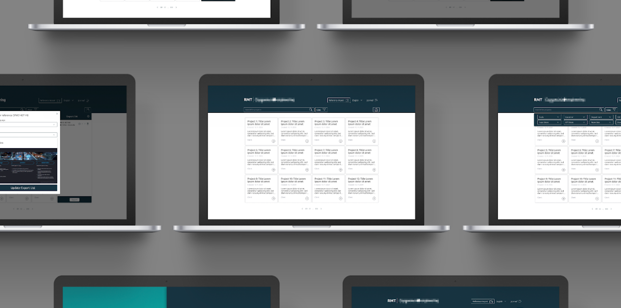
Final Screens
Dashboard & Project Overview
A centralised view of all archived projects with clear status indicators and quick-access actions.
RATIONALE
Strong visual hierarchy allows managers to scan and locate projects at a glance, reducing cognitive load during high-volume workflows.
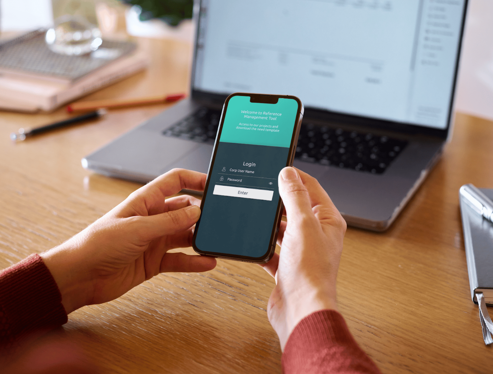
Upload & Archiving Flow
A guided, step-by-step interface for uploading and categorising project information.
RATIONALE
Breaking the process into logical steps reduced errors and made the workflow approachable for all user types.
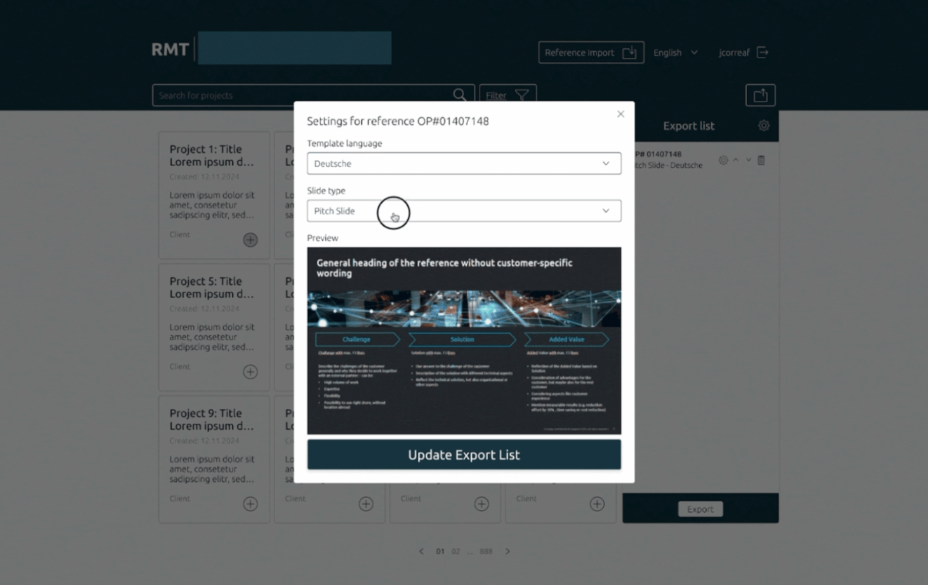
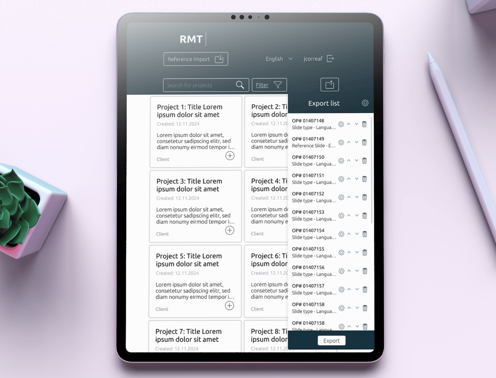
Template Export
A clear and accessible export module allowing managers to download project data as formatted templates for internal and external use.
RATIONALE
Streamlined export flow with clear formatting options ensures outputs are presentation-ready with minimal effort.
Results & Impact

40%
Reduction in design-to-development handoff time through the component library

Wireframe → Prototypes
W → P
Full responsive coverage across all key device sizes

100%
Brand consistency maintained throughout, in line with the company style guide
+3
Rounds of stakeholder feedback integrated through an iterative design proce

100%
Cohesive visual identity aligned across 30+ screens and all platform modules
92%
Detailed specs delivered including style guides, component libraries, and interaction guidelines
What I Learned

Designing for B2B platforms requires balancing business logic with user simplicity, managers need power and efficiency, not decorative complexity.
Conducting thorough desk research and competitive analysis early on provided a strong foundation for design decisions and helped avoid common pitfalls seen in competitor platforms.
Starting with a well-structured component library from day one ensured consistency across all screens and significantly reduced the time needed for developer handover.
Iterative prototyping and regular stakeholder feedback loops were essential. Issues that seemed minor in wireframes became clear usability problems in high-fidelity prototypes.
Designing with the company's style guide as a constraint, rather than a limitation, ultimately led to a more focused and coherent visual outcome that felt native to the brand.

Design integrated and meaningful experiences.
Let’s Work Together
I’m always interested in hearing about new projects and opportunities.
GET IN TOUCH
© 2026 Johanna Correa. All rights reserved.
Connect


START
CONTACT
Reference Management Tool
Redesigning a B2B platform for seamless project archiving and internal knowledge management
Implement a first UI for a MVP and implement new features ensuring user experience
Role:
Product Designer, UX/UI Designer
Team:
1 Project Manager, 1 Product Owner, 3 Developers
Duration:
9 months
How do you design a B2B platform that makes complex information management feel effortless?
Context
PRODUCT
A B2B platform designed for company managers to upload, store, and manage project information systematically. The platform enables teams to archive all company projects in one place and export that information as downloadable templates for internal and external presentations.
USERS
Company managers who need to organize, retrieve, and share project data efficiently. Users range from those comfortable with complex workflows to those who prefer simplified, guided interactions.
BUSINESS GOAL
Revamp the platform's visual design to align with the company's brand identity, improve usability for day-to-day project management, and create a scalable design system that supports future product growth.
CONSTRAINTS
•
Complex information hierarchies needed to be simplified into intuitive, manageable flows
•
Design had to remain consistent with an existing company style guide while introducing new visual clarity
•
Responsive prototypes required to ensure a seamless experience across devices and screen sizes
•
Tight collaboration needed across stakeholders, designers, and developers to ensure accurate implementation
UX • UI • Product
Mar 2024 – Dec 2024
Cross-functional
The Challenge

Visual inconsistency: The existing platform lacked a cohesive visual language, making it feel fragmented and difficult to navigate for managers handling multiple projects.
Complex information architecture: Project data involved multiple layers of content that needed to be presented clearly without overwhelming the user.
Brand alignment: The redesign had to respect and extend the company's existing style guide while modernising the interface.
Handover accuracy: Ensuring design intent translated faithfully into development required thorough documentation and close collaboration.
The Messy Middle
The Solution
Final Screens
Dashboard & Project Overview
A centralised view of all archived projects with clear status indicators and quick-access actions.
RATIONALE
Strong visual hierarchy allows managers to scan and locate projects at a glance, reducing cognitive load during high-volume workflows.
Upload & Archiving Flow
A guided, step-by-step interface for uploading and categorising project information.
RATIONALE
Breaking the process into logical steps reduced errors and made the workflow approachable for all user types.
Template Export
A clear and accessible export module allowing managers to download project data as formatted templates for internal and external use.
RATIONALE
Streamlined export flow with clear formatting options ensures outputs are presentation-ready with minimal effort.
Results & Impact

40%
Reduction in design-to-development handoff time through the component library
Wireframe → Prototypes
W → P
Full responsive coverage across all key device sizes

100%
Brand consistency maintained throughout, in line with the company style guide
+3
Rounds of stakeholder feedback integrated through an iterative design proce
100%
Cohesive visual identity aligned across 30+ screens and all platform modules
92%
Detailed specs delivered including style guides, component libraries, and interaction guidelines
What I Learned

Designing for B2B platforms requires balancing business logic with user simplicity, managers need power and efficiency, not decorative complexity.
Conducting thorough desk research and competitive analysis early on provided a strong foundation for design decisions and helped avoid common pitfalls seen in competitor platforms.
Starting with a well-structured component library from day one ensured consistency across all screens and significantly reduced the time needed for developer handover.
Iterative prototyping and regular stakeholder feedback loops were essential. Issues that seemed minor in wireframes became clear usability problems in high-fidelity prototypes.
Designing with the company's style guide as a constraint, rather than a limitation, ultimately led to a more focused and coherent visual outcome that felt native to the brand.

Design integrated and meaningful experiences.
Let’s Work Together
I’m always interested in hearing about new projects and opportunities.
GET IN TOUCH
© 2026 Johanna Correa. All rights reserved.
Connect
START
CONTACT
Reference Management Tool
Redesigning a B2B platform for seamless project archiving and internal knowledge management
Implement a first UI for a MVP and implement new features ensuring user experience
Role:
Product Designer, UX/UI Designer
Team:
1 Project Manager, 1 Product Owner, 3 Developers
Duration:
9 months
How do you design a B2B platform that makes complex information management feel effortless?
Context
PRODUCT
A B2B platform designed for company managers to upload, store, and manage project information systematically. The platform enables teams to archive all company projects in one place and export that information as downloadable templates for internal and external presentations.
USERS
Company managers who need to organize, retrieve, and share project data efficiently. Users range from those comfortable with complex workflows to those who prefer simplified, guided interactions.
BUSINESS GOAL
Revamp the platform's visual design to align with the company's brand identity, improve usability for day-to-day project management, and create a scalable design system that supports future product growth.
CONSTRAINTS
•
Complex information hierarchies needed to be simplified into intuitive, manageable flows
•
Design had to remain consistent with an existing company style guide while introducing new visual clarity
•
Responsive prototypes required to ensure a seamless experience across devices and screen sizes
•
Tight collaboration needed across stakeholders, designers, and developers to ensure accurate implementation
UX • UI • Product
Mar 2024 – Dec 2024
Cross-functional
The Challenge

Visual inconsistency: The existing platform lacked a cohesive visual language, making it feel fragmented and difficult to navigate for managers handling multiple projects.
Complex information architecture: Project data involved multiple layers of content that needed to be presented clearly without overwhelming the user.
Brand alignment: The redesign had to respect and extend the company's existing style guide while modernising the interface.
Handover accuracy: Ensuring design intent translated faithfully into development required thorough documentation and close collaboration.
The Messy Middle
The Solution
Final Screens
Dashboard & Project Overview
A centralised view of all archived projects with clear status indicators and quick-access actions.
RATIONALE
Strong visual hierarchy allows managers to scan and locate projects at a glance, reducing cognitive load during high-volume workflows.
Upload & Archiving Flow
A guided, step-by-step interface for uploading and categorising project information.
RATIONALE
Breaking the process into logical steps reduced errors and made the workflow approachable for all user types.
Template Export
A clear and accessible export module allowing managers to download project data as formatted templates for internal and external use.
RATIONALE
Streamlined export flow with clear formatting options ensures outputs are presentation-ready with minimal effort.
Results & Impact

40%
Reduction in design-to-development handoff time through the component library
W → P
Wireframe → Prototypes
Full responsive coverage across all key device sizes

100%
Brand consistency maintained throughout, in line with the company style guide
+3
Rounds of stakeholder feedback integrated through an iterative design proce
100%
Cohesive visual identity aligned across 30+ screens and all platform modules
92%
Detailed specs delivered including style guides, component libraries, and interaction guidelines
What I Learned

Designing for B2B platforms requires balancing business logic with user simplicity, managers need power and efficiency, not decorative complexity.
Conducting thorough desk research and competitive analysis early on provided a strong foundation for design decisions and helped avoid common pitfalls seen in competitor platforms.
Starting with a well-structured component library from day one ensured consistency across all screens and significantly reduced the time needed for developer handover.
Iterative prototyping and regular stakeholder feedback loops were essential. Issues that seemed minor in wireframes became clear usability problems in high-fidelity prototypes.
Designing with the company's style guide as a constraint, rather than a limitation, ultimately led to a more focused and coherent visual outcome that felt native to the brand.

Design integrated and meaningful experiences.
Let’s Work Together
I’m always interested in hearing about new projects and opportunities.
© 2026 Johanna Correa. All rights reserved.
Connect